PORTFOLIO // Logos
Lantana Chiropractic
Once Dr. Bradley Meier went from partner to full owner of his Delaware chiropractic business, he wanted to refresh the former dated logo with something uncomplicated and modern, featuring a color palette that suggested calm and clean. The new logo is perfect for the practice’s rebranding.
101.9 The Bay
The sun rising over the waves in this design beautifully evokes Little Traverse Bay, the station’s namesake. The Bay (WLDR-FM) is an Adult Contemporary radio station located in Traverse City, Michigan, and simulcast as WARD-AM in Petoskey, Michigan.

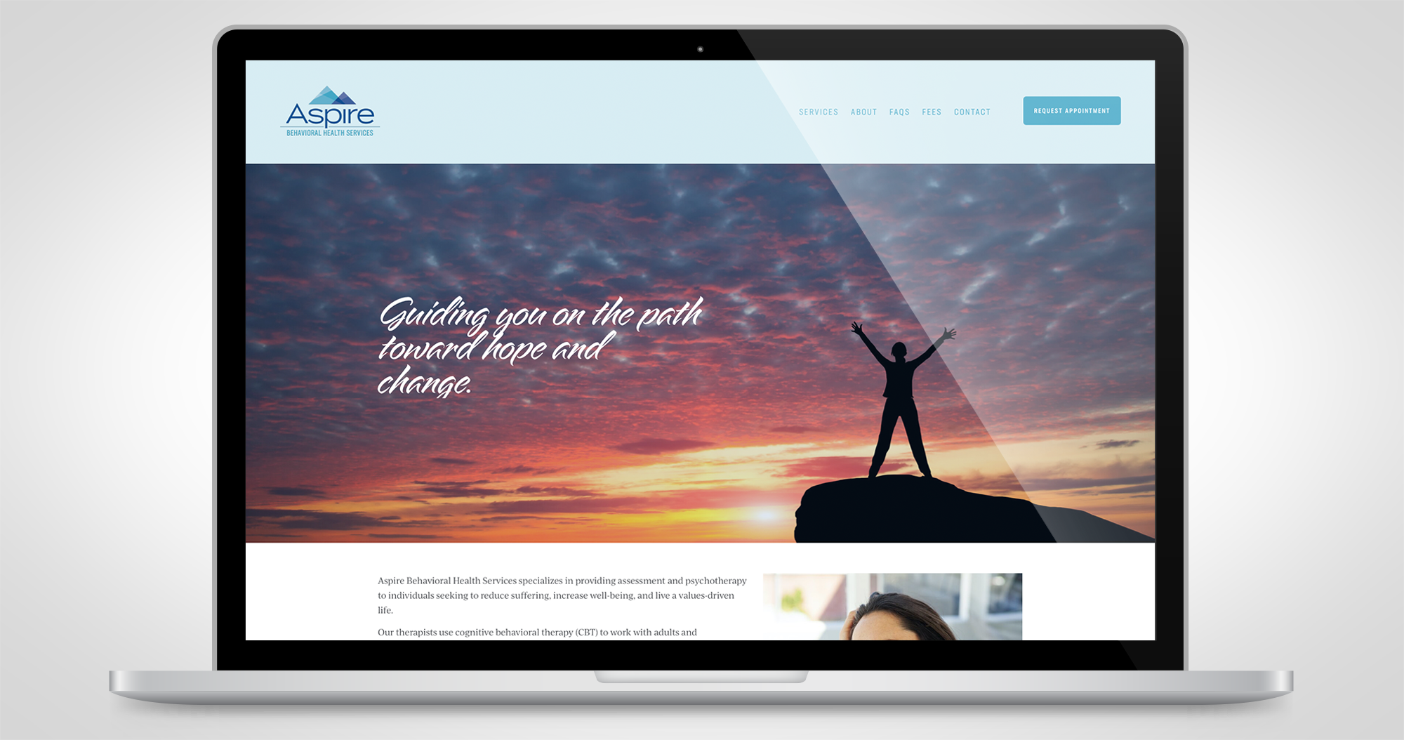
Aspire Behavioral Health Services
With the creation of a new psychotherapy practice, therapists at Aspire Behavioral Health Services, required full branding. This logo and corporate identity, featuring mountain imagery and soothing watercolor background, reflects the uplifting mission of the practice: to provide psychotherapy to individuals seeking to reduce suffering, increase well-being, and live a values-driven life.
Todd Broady Voiceovers
With masculine lettering to match Todd’s deep voice and a subtle nod to audio devices’ play buttons, this logo was an ideal fit for Todd Broady Voiceovers, a commercial voiceover and audio production service.
Wicked Awesome 80s Show
Exemplifying the 80s with neon-bright colors, a cassette, and retro fonts, this logo is perfect for a weekly radio show featuring music and pop culture trivia from the 80s.
Center for Drug & Health Studies
This design for University of Delaware’s Center for Drug & Health Studies, expresses the collaborative work of the center, which facilitates research on substance abuse, health risk behavior, health services, and health policy.
Lite Rock 105
It’s always a challenge when a heritage radio station (WWLI-FM in Providence, Rhode Island) wants to update branding long-established in the market. The revised Lite Rock 105 logo has been modernized and cleaned up, yet retains a similar palette and the recognizable “swoosh” element.
The Wine Pairing
A fresh take on mid-century modern gives this logo design a fun vibe for husband and wife wine reviewers.
Museum Studies
Working within the University of Delaware’s color palette and branding specifications, the logo for Museum Studies embodies the spirit of the program. Dr. Kasey Grier, director of the program, puts it best: “Our new logo reflects the good energy of the Museum Studies Program and the relations that we have worked to build. It is based on four circles, representing our students, the program faculty and staff, our partners (both institutional and individual), and the extraordinary resources of our university. It’s really a Venn diagram in motion, and my ambition is to foster and enhance the ‘sweet spot’ where all these circles meet, and to keep the resulting energy and expertise moving forward together.”
Electric Mayhem
Successful robotics team, Electric Mayhem, from the Nichols School in Buffalo, New York, competes at yearly high-level regional and national events. They requested a logo utilizing their school colors, team number and name. The mischievous electrical outlet brought the design together and has been lauded by the entire team.
Bill’s Speedometer Shop
Bill’s has been building, fixing, and restoring classic speedometers since 1962. When owner/operator Patrick Mescher bought the business, he wanted a logo that acted as a nod to the eras of the speedometers on which he works.
Warm 98.5
With a new tagline, management at Cincinnati’s Warm 98.5 wanted to freshen their station logo while retaining many elements from the original logo, which had been in use for the past 20 years. They are delighted with this contemporary version, which appears on everything from website and T-shirts to a van wrap.
The New 95.1 KBBY
After 15 years as B95.1, KBBY, an adult contemporary radio station in Ventura, California, wanted to freshen its branding in 2015, complete with a new name, logo, and tagline. The result is a contemporary logo to match its updated format.
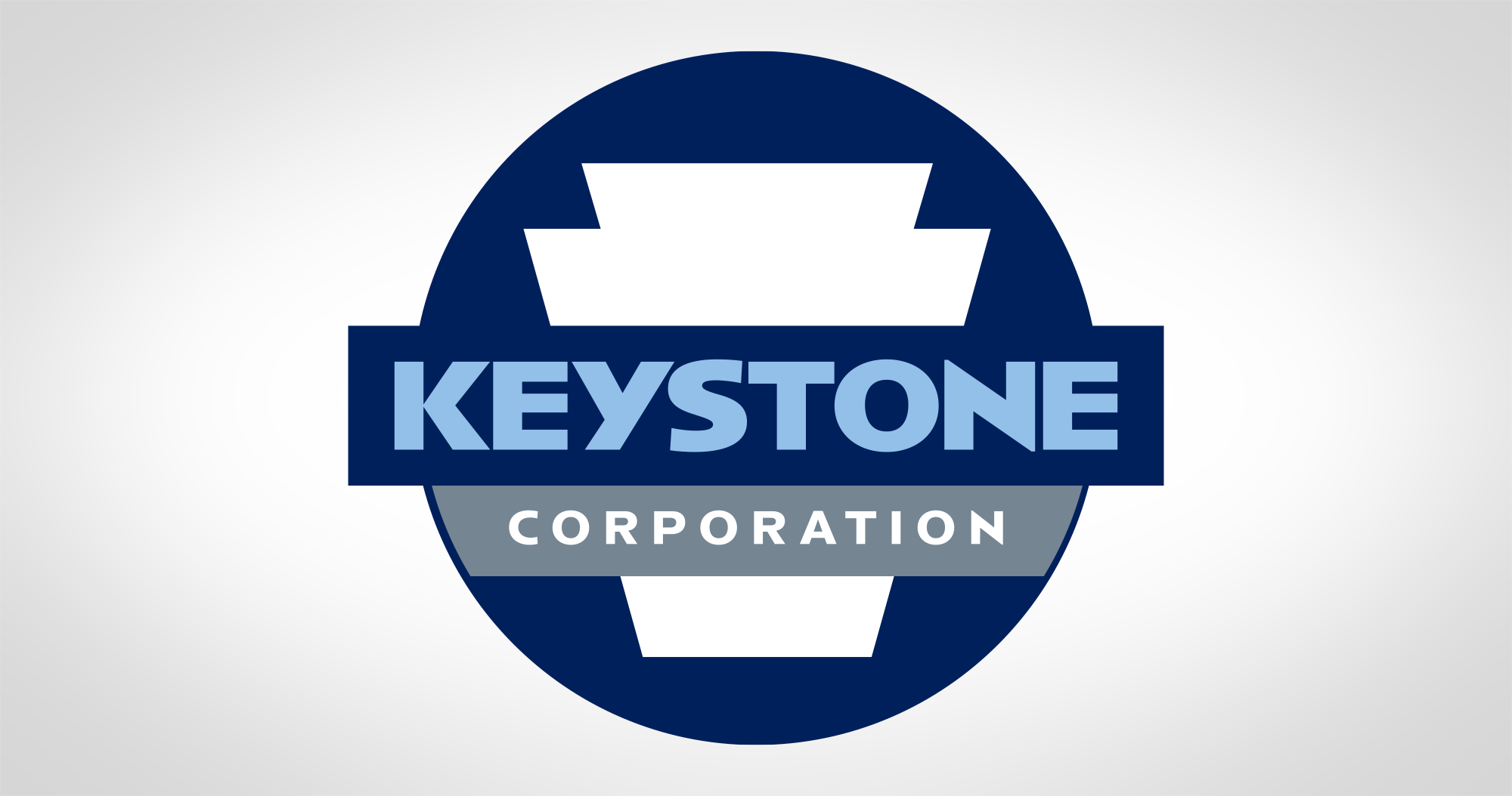
Keystone Corporation
Keystone Corporation, a company providing metal finishing and electroplating services since 1928, was making a move to a new facility and Michael Karet, Keystone’s vice president, wanted to refresh its logo. The new design looks modern, solid, and most importantly, pays homage to the corporation’s original logo.

The Whale 105.5
A new radio station in St. Augustine, Florida, WALE (“The Whale”) 105.5, needed an eye-catching logo. This design set the right tone with its mostly older male audience.
more portfolio categories


“Heather is simply one of the most talented designers I know. If you are looking for a designer who is left brained and right brained, and who understands the relationship between design, development, and marketing, Heather is your woman.”
// PAUL SCHMIDT, PAUL SCHMIDT VOICEOVER